
We know many of the engineers want to plot their data in Excel. We’ve had a question about where to get the data and how to work with our odd date format.
Our ThingSpeak feeds will only allow a limited amount of data download – if you want your full data set, you need to go to Github for it:
To get your data, click on your feed and click on the “Raw” button.
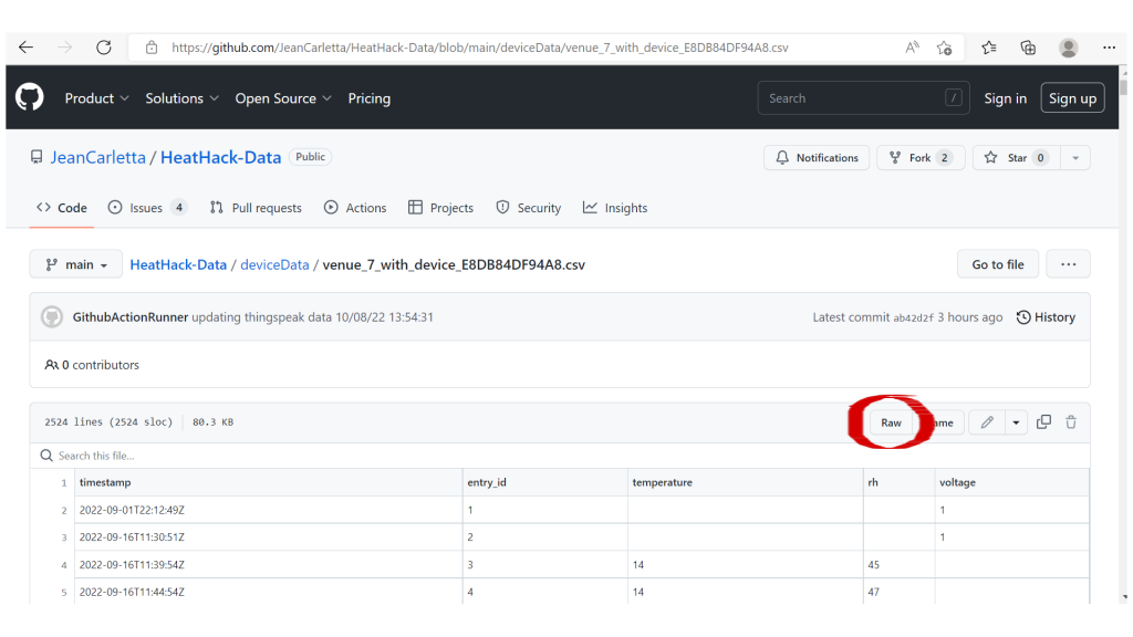
You’ll see a CSV file – you can then right-click in the browser and choose “save as” to save the file.
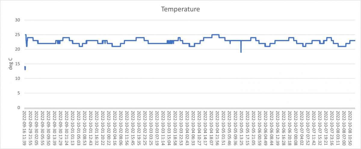
Open the file in Excel. and then you can use the example spreadsheet here to get a basic plot of temperature. Download it, don’t open it in your browser.
This adds a column to the data that extracts a date/time format Excel can recognise using this formula, e.g., to fill cell A2 from the value of cell B2:
- =VALUE(SUBSTITUTE(SUBSTITUTE(B2,”T”,” “),”Z”, “”))
Here’s an example timestamp: 2022-09-16T12:14:52Z. The formula literally replaces the T with a blank, replaces the Z with nothing, and then extracts the value of the string as a number. If you then format that number with a date-time format, for instance, dd/mm/yyyy hh:mm, it will look right.
The only other trick you need to know is that you have to format the x-axis as text, not a date. If you format it as a date, it will treat all values on that date as the same time and give you a graph with lots of vertical lines.